Want to know what’s going on in the world? Then go to Trendsmap and find out.

Want to know what’s going on in the world? Then go to Trendsmap and find out.

The latest talk hosted by Long Lunch this October is by London based multidisciplinary design studio Proud Creative. These events are usually top notch and this one looks no different. Proud Creative have produced some fantastic work recently including a rebrand for former Sci Fi Channel Syfy (pronouced “Sci Fi”). Event is at the Glasgow School of Art. Get tickets quick!
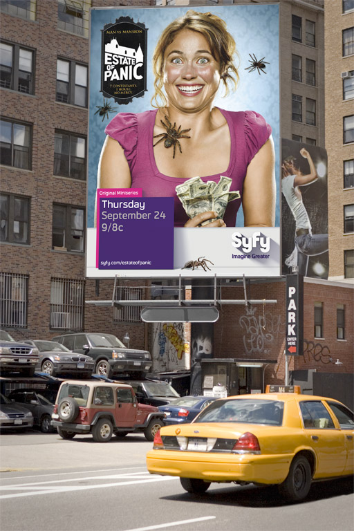
And some more Proud work whet the Long Lunch appetite!

A lamp post in downtown Vancouver becomes an out-of-home (OOH) optical illusion. Effective spacial advertising from advertising agency Cossette Atlantic McDonalds. Found on Computer Luv

Stumbled upon a really nice set if Royalty Free icons called helveticons. $279 you may never need to purchase any icons from Stock library ever again. All available in different size and in vector format.
![]()
Stumbled upon this advert for the Guardian’s 7 part World War II supplement from Ben Terrett, writer of blog Noisy Decent Graphics. Such a simple but great idea.
Originally featured on the cover of The Drum magazine this is Design Beast by Sophie Rollier which has been turned into a handmade toy by Pam MacDonald (both from RRD Creative Edinburgh.)

Poke recently redesigned the Man City website. It looks sweet but what of the other 19 teams? As the premiership season is now in full swing, who is the champions when it comes to football teams websites? And who will be fighting the design relegation battle? To be honest after reviewing all 20 there pretty much all the bloomin’ same.
01 Man City
The clear winner. The website has gelled well with lots of top superstar elements. Nice big images. Slick design, everywhere. Actually quite simple but has a perfect balance of images and text. Really interesting content including videos with highlights, flickr images, twitter feed and nice links to fan sites. Also the only site not to have a splash page.

02 Chelsea
At first glance this site seems to be like the rest but it features a nice section called ‘The Shed’ which host fan polls, twitter feeds, a rumour mill, etc. Not quite executed all that well but at least they’re trying something a bit different.

03 Sunderland
The north-east’s only representitive comes up trumps. Ok so it’s pretty standard in term of content but the design has got a nice sophisticated depth to it. And a nice interactive peice with the team profiles.

04 Portsmouth
Nicely designed. Breaks the mould for the standard layout of other team website. Has a nice depth to it. A little hard to read.
05 Hull City
Yet another splash page. There a theme running here. Maybe the worst splash page so far. Could even find my way off it. The website itself goes dark, which is pretty nice. Early contender for a champions league spot.
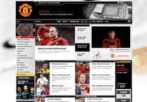
06 Man Utd
The premiership champions are definitely the losers in the website stakes when compared to their city rivals. Quite boxy although the information is quite easy to digest. Not exactly the field of dreams.
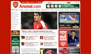
07 Arsenal
Why do they need a splash page? I mean c’mon. Rest of it is pretty standard fair. Again quite boxy and nothing really that inspirational.
08 West ham
Standard layout as many of the rest but has got a little Italian style sleekness. Must be the Zola factor

09 Everton
There is a lot of content on the Everton site and whilst it is a little messy it has a lot to offer it’s fans. Also includes a really nice youth development site called The Everton Way.

10 Liverpool
Splash page alert. Annoying. The site is very crammed with info. Not sure where to look.

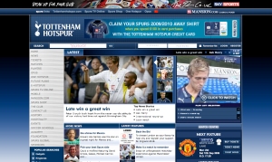
11 Tottenham
Another splash page. Grr! Another standard style website. Pretty easy to navigate.
12 Burnley
Punching above their weight both on field and on the website.

13 Wolves
I swear there is like one company that does all these website. They’re all the same.

14 Stoke
Standard mid-table mediocracy.

15 Wigan
Same as all the rest syndrome

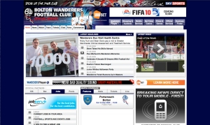
16 Bolton
Same design as most of the other mid tablers. Although this one is a nice deep violet colour. Pretty!
17 Blackburn
Same design as most of the other mid tablers. Although this one is an ugly blue colour. Yuch!

18 Aston Villa
Splash page with a cheeky animation. Site itself is pretty flat.

19 Fulham
Info heavy. Not very exciting

20 Birmingham
Whoa. Shocking! Looks cheap. Everything is a really ugly blue colour

You must be logged in to post a comment.